UX and Web Design Case Study
Check Point Web
Check Point Software is a leading provider of enterprise cybersecurity solutions for corporations and governments worldwide. This project focused on leading the redesign of Check Point Software’s product pages and corporate website. The existing site was outdated and compromised user experience, failing to enable visitors to achieve their goals effectively.
Goals
01. Strategically improve the UX/UI of the website utilizing user feedback, analytics and continued research and testing
02. Modernize the design following current trends in UI and Design
03. Optimize content for multi-device viewing
04. Maintain consistent design production for future updates with elaborate design systems
Title
Design Manager/UX Designer
Skillset
Research, Content Strategy, Information Architecture, Wireframes, Design, Testing,
Design Systems
My Process

Scope
Define, Gather, Align

Research
Inquire, Observe, Engage

Ideate
Define, Brainstorm, Sketch

Create
Prototype, Design, Build

Validate
Test, Refine, Iterate
Scope
Discovery Workshop
During the initial discovery phase, the process began with introductions, requirements gathering, goal definition, and soliciting input from both business and product perspectives. Stakeholders’ thoughts and needs were further explored through tailored surveys distributed among key individuals. These surveys focused on:
- Identifying primary goals and objectives in alignment with the product and business teams to ensure clarity and cohesion in the project direction.
- Outlining technical constraints and specifications to match the development team’s capabilities and requirements, ensuring feasibility and alignment with project objectives.
- Gathering customer insights and brand requirements to align with the marketing and design teams’ vision, ensuring consistency with the overall brand strategy.
This structured approach facilitated the collection of comprehensive insights from various perspectives, establishing a solid foundation for informed decision-making and effective project execution.
Key Findings
01.
Business
-Conversion rates were significantly lower than industry benchmarks, leading to missed revenue opportunities.
-Competitor websites were designed in terms of user engagement, user-friendly design was needed to stay competitive.
-ROI for a redesign was justifiable because of the potential increase in customer conversions.
02.
Product
-Complete restructure of the product offerings is in progress. Need to accommodate for the revised product offerings.
-Align website launch with new product launches and annual CPX event in January.
03.
Marketing
-Need for more gated content for lead generation.
-Accommodate for targeted campaigns that will be changing and evolving over time.
-Increase website conversion rate, and look into SEO and Salesforce to drive opportunities.
04.
Development
-Outdated tech stack and the need to modernize the CMS to manage content efficiently.
-Design with scalability in mind to accommodate websites long-term viability.
Understanding the Competitive Landscape
Research commenced with an analysis of how Check Point’s website compares to those of other software security companies. This foundational understanding provided insights into how competitors convey their brand and products to their audiences.
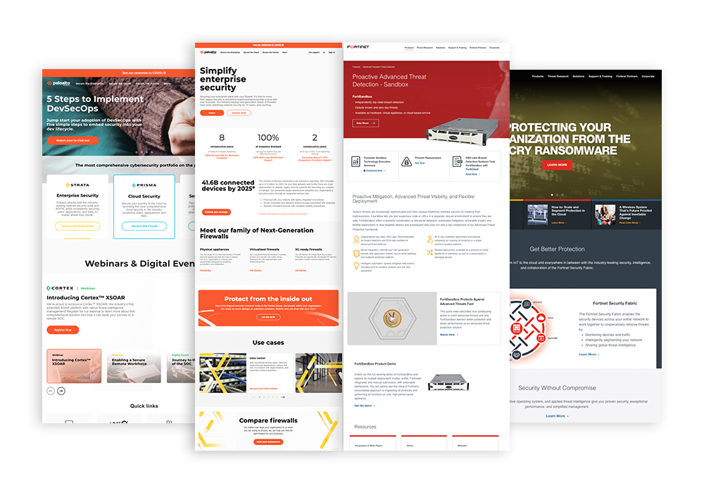
Grabs of Palo Alto Networks and Fortinet Websites
Competative Research Findings
01.
UX and UI Design Approach
-Company A emphasizes a user-friendly and intuitive interface with clear navigation and modern design elements, catering to users of all levels.
-Company B’s approach offers in-depth content more tailored for IT professionals.
02.
Marketing Content and Branding
-Company A utilizes marketing content to highlight its user-friendly approach and emphasizes branding elements that evoke simplicity and accessibility.
-Company B’s marketing content targets IT professionals, focusing on advanced features and technical capabilities, with branding that reflects expertise and innovation.
03.
User Interface Clarity and Efficiency
-Company A’s interface focuses on simplicity and clarity, featuring easy-to-understand design elements and straightforward navigation paths for a hassle-free experience.
-Company B’s interface offers advanced functionality with granular features (comparison tools).
04.
Visual Design and Aesthetics
-Company A focuses on clean and modern design aesthetics, prioritizing visual clarity and simplicity for an engaging user experience.
-Company B’s design is more technical and detailed, featuring advanced visualizations and data representations for IT professionals.
Understanding the Experience
Quantitative Research
Website visitor behaviors, interaction patterns, and overall performance were analyzed using various research methods. The insights gathered guided the effective arrangement of the site’s architecture.
Tools used to gather experience data:
- Google Analytics
- Crazy Egg
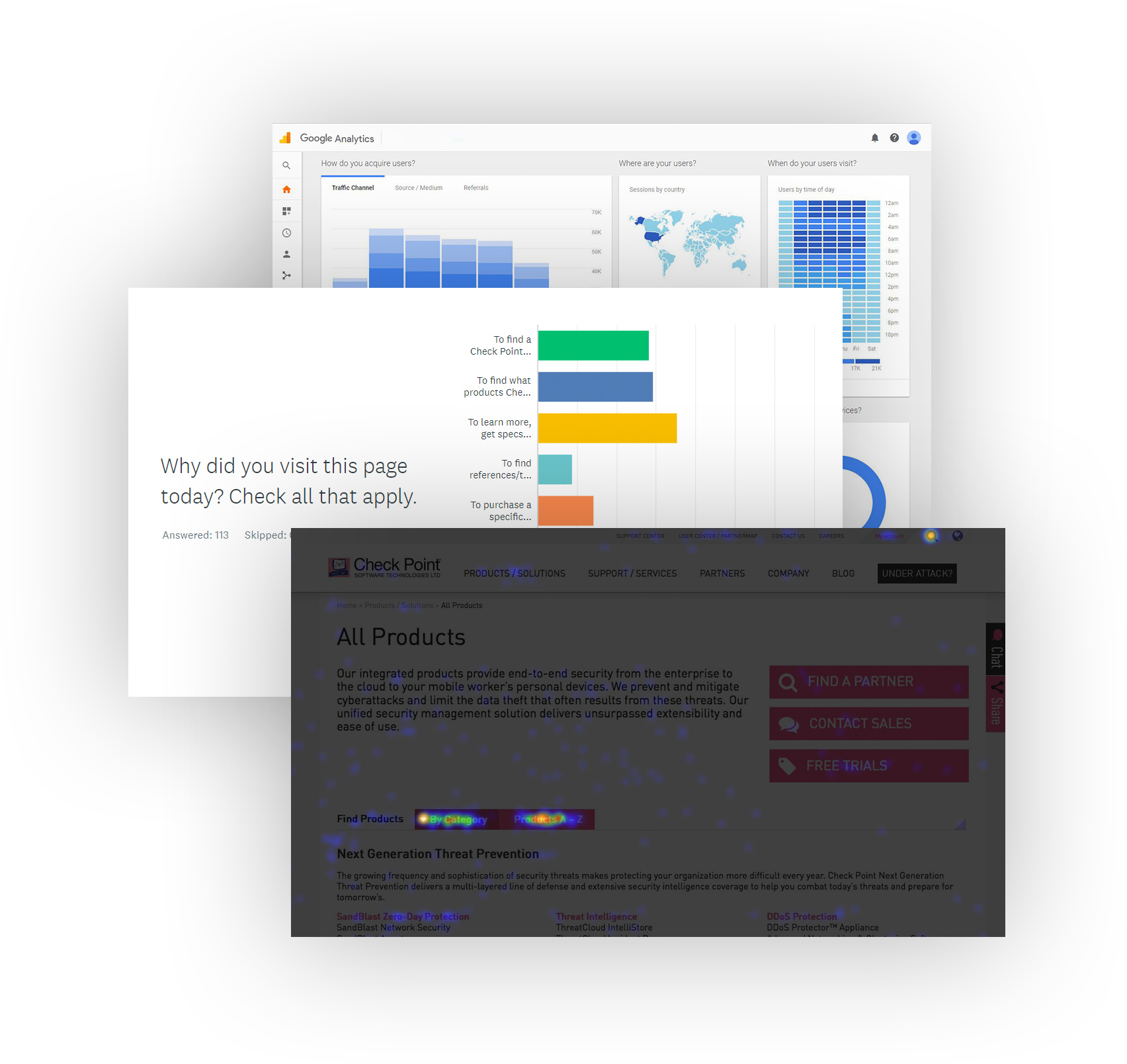
Grabs from various reserach reports
Google Analytics Findings
Collaboration with the analytics team involved collecting metrics and data from Google Analytics.
Key data points evaluated included:
- User flows
- Bounce rates
- Session durations
- Pages per session
- Site search usage
- Device and browser usage
This analysis identified which pages performed well, areas where users encountered obstacles, and the types of content that resonated with them.
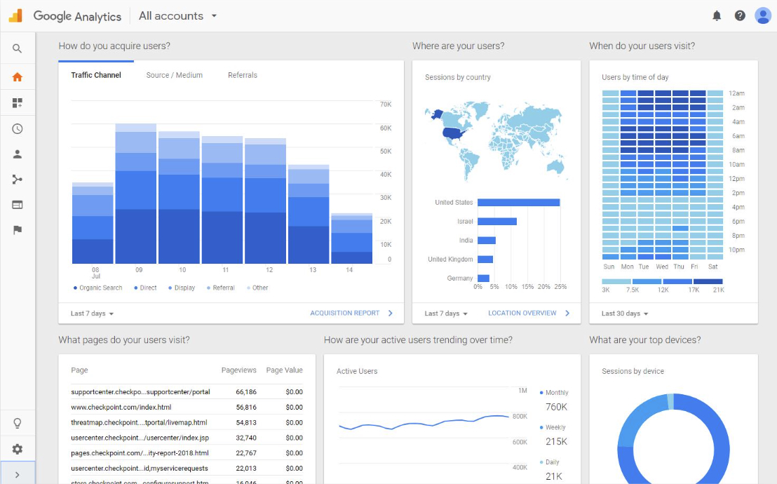
Grab from the Google Analytics Report
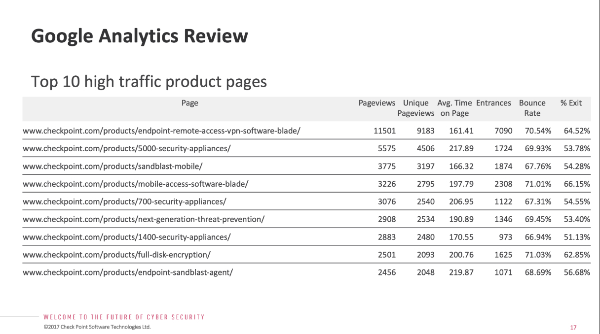
Grab from the Google Analytics Report
Crazy Egg Findings
This analysis highlighted high-performing pages, pinpointed user obstacles, and revealed the types of content that resonated most with visitors.
Some of the behaviors I observed:
- People are bypassing sections with heavy copy and going directly to technical content and links that were not easy to find.
- People are mostly at the top navigation, heavily using search to navigate to find what they are looking for.
- People fail to scroll down lengthy pages to access important content hidden at the bottom of pages. Even worse, the mobile experience made content harder to access.
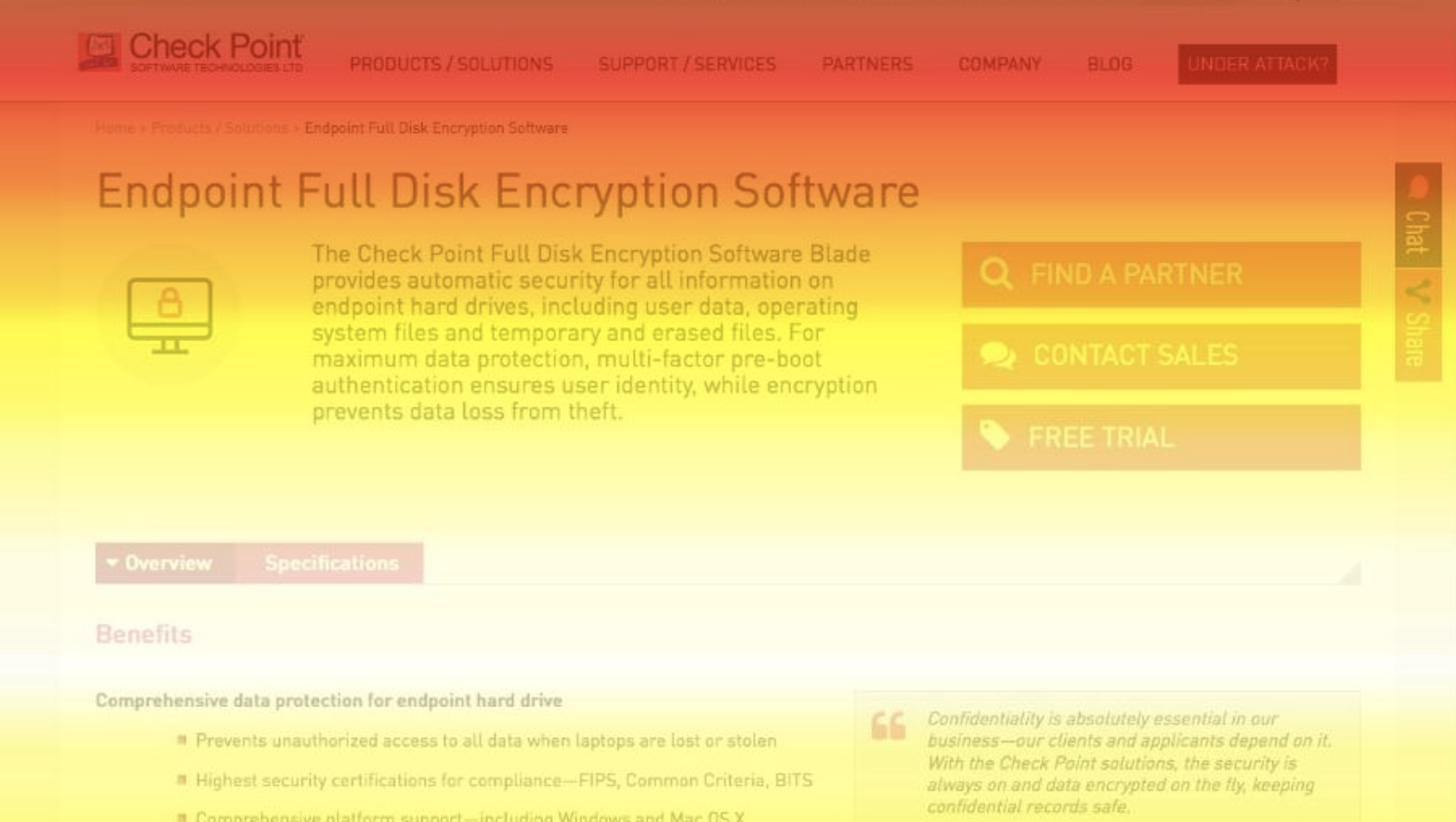
Scrollmap from Crazy Egg
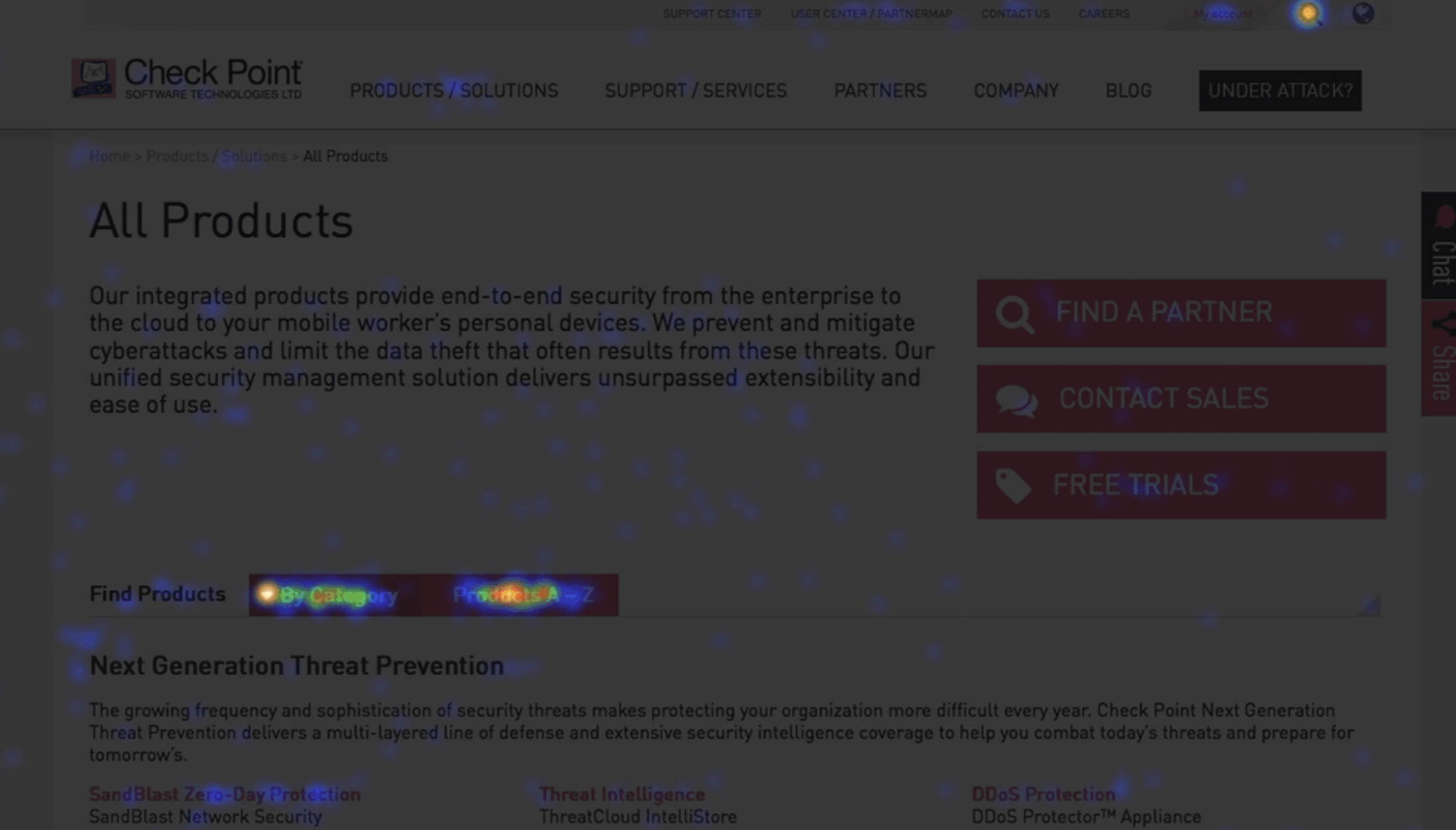
Heatmap from Crazy Egg
Understanding the People
Ethnographic Research
After analyzing the marketing team’s ethnographic research and customer personas, insights were gained into the top visitors and their goals when interacting with the website. Key goals of the website visitors included:
- Review c-level content (thought leadership, industry trends)
- Learn more about a product, such as get specs, download white papers or watch videos.
- Find references or testimonials to influence purchase
- Purchase a specific product or solution
- Download trial or demo
- Look for support to solve an issue
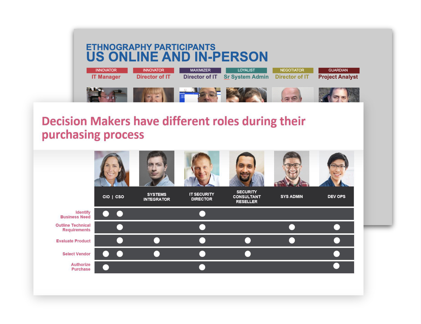
Grabs from the Ethnographic Research Report
User Feedback Surveys
Feedback was collected from over 175 participants over an 8-week period. The suggestions and comments provided were invaluable in understanding users’ specific goals and pain points while searching for content.
When a person was exiting a specific page, a survey would appear before page closure or exit. They were asked:
- Why they visited the page
- Did they find what they were looking for
- How easy was it to achieve their goal
- Share any comments or suggestions
- Provide email for contact regarding the issue
(20% provided their email and we reached out to them to get further details)
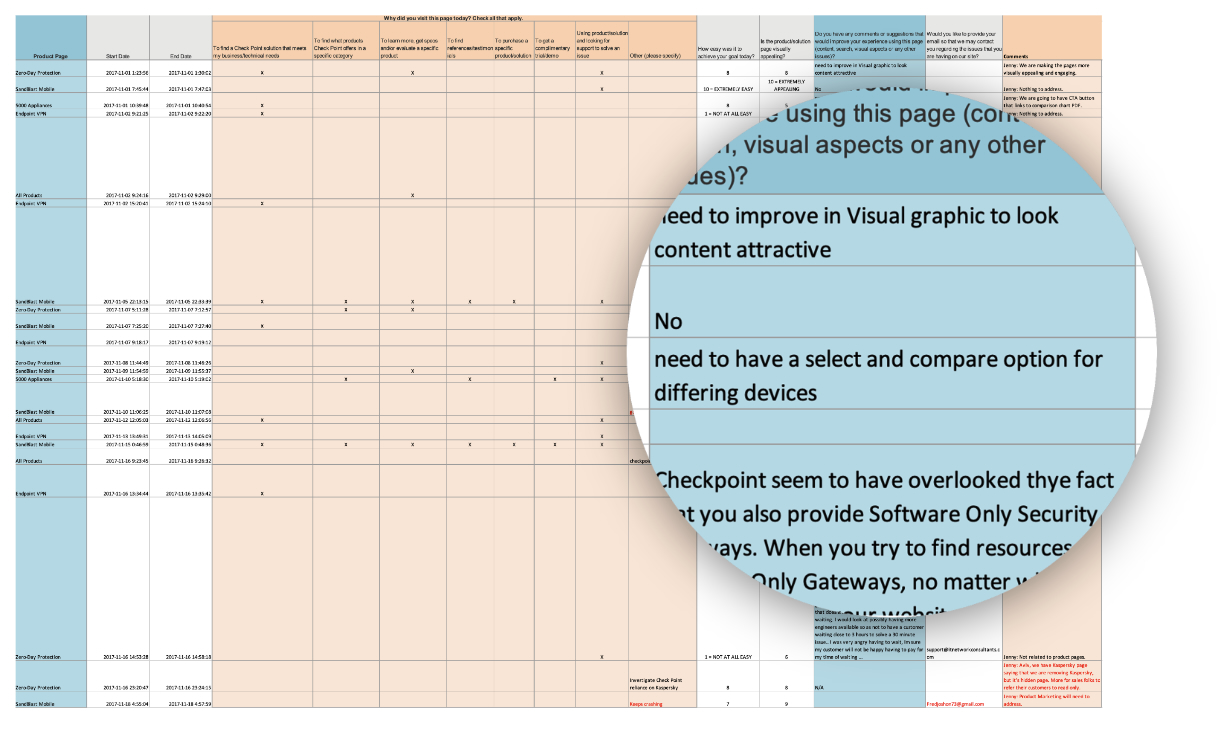
Survey Results Spreadsheet
Key User Research Findings
Pain Point 1 – Difficulty Finding Technical Information and Critical Product Specs
People struggle to locate technical information and critical product specifications that should be readily accessible. This information is essential for making informed decisions about the product.
Impact on User Experience:
- People become frustrated when they cannot find the information they need.
- People waste time searching for technical details, affecting productivity.
- Difficulty in finding critical information erodes trust in the product and brand.
Pain Point 2 – Unclear Functionality and Benefits Due to Vague Descriptions
People struggle to understand the functionality and benefits of the product or its features due to vague or unclear descriptions. This hinders their ability to comprehend the product’s value.
Impact on User Experience:
- People feel uncertain about the product’s capabilities and value proposition.
- People waste time trying to decipher vague descriptions, leading to frustration.
- Lack of clarity erodes trust in the product’s effectiveness.
Pain Point 3 – Poor Navigation and Page Structure
People encounter difficulties navigating the site due to poor navigation and page structure. This makes it challenging for them to find the information they need.
Impact on User Experience:
- People struggle to navigate the site, leading to frustration.
- Poor navigation wastes peoples’ time and effort.
- People may leave the site if they cannot find what they are looking for quickly.
Ideation
Strategy Workshops
Following the analysis of all research, three focal points were identified, each with specific goals and artifacts to consider during the strategy workshops in the Ideation Phase.
Ideation Criteria
01.
Architecture
- Implement an intuitive navigation structure for easy browsing.
- Maintain a consistent page layout and structure throughout the site.
- Streamline navigation options to minimize decision fatigue and confusion.
Artifacts: Content Audit, Sitemap
02.
Content
- Provide clear and detailed descriptions of product features and benefits.
- Illustrate how features work with real-life examples to enhance understanding.
- Use simple and clear language that is easy for people to understand.
Artifacts: Content diagrams, Content guides
03.
Experience
- Ensure technical information and product specs are logically organized and easily accessible.
- Display critical product specifications prominently on product pages.
- Focus on simplicity and clarity while designing for multi-device experiences.
Artifacts: Wireframes
Information Architecture
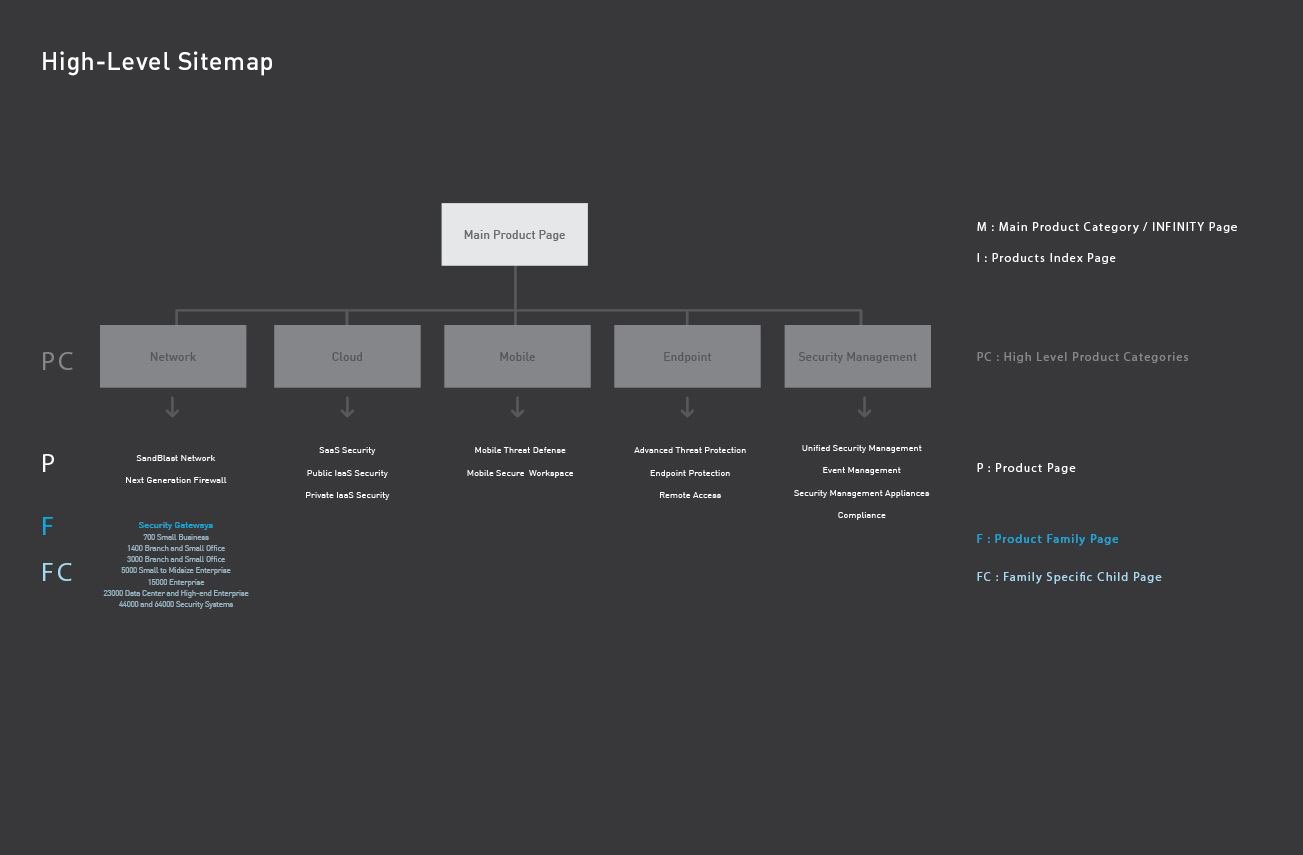
Collaboration with the Head of Digital Operations and the VP of Products led to the development of a sitemap for the redesigned pages. This process involved conducting a content audit to evaluate existing content and analyze the current website structure.
During the sitemap creation, the hierarchical structure of the pages was mapped out, defining main categories, subcategories, and page relationships. Using XD, the sitemap was visualized and iterated upon based on feedback.
Ongoing strategy workshops were held throughout the project to align the new pages and structure with upcoming product releases and reorganized product offerings. Key stakeholders and product owners were identified and maintained close communication to ensure alignment with overall project goals.
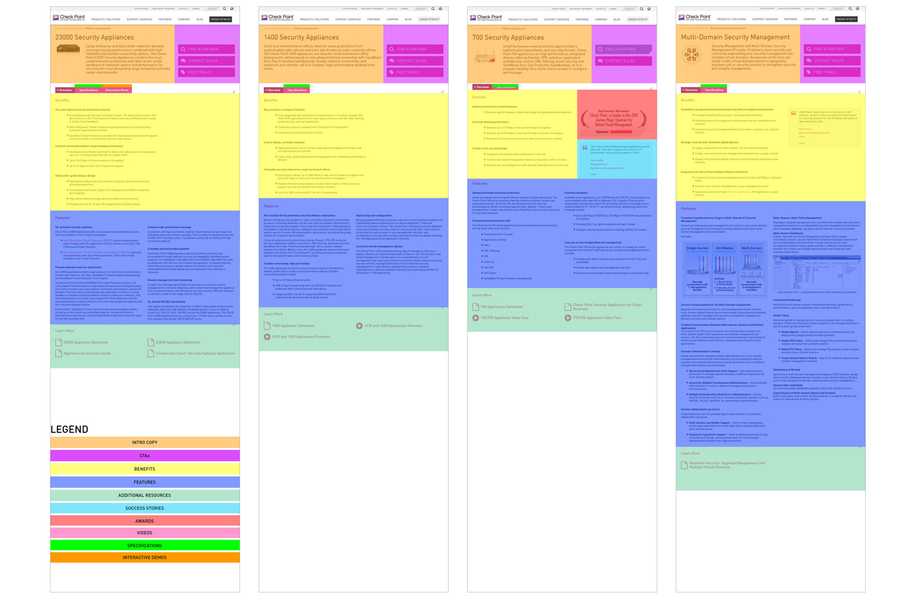
Content Audit
Sitemap
Proposed Solutions
Content Strategy
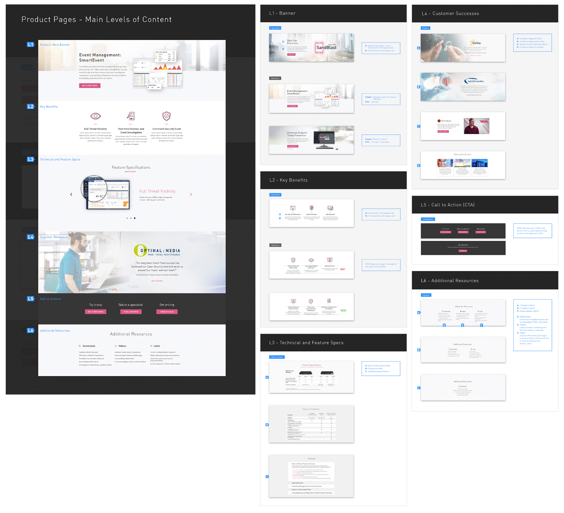
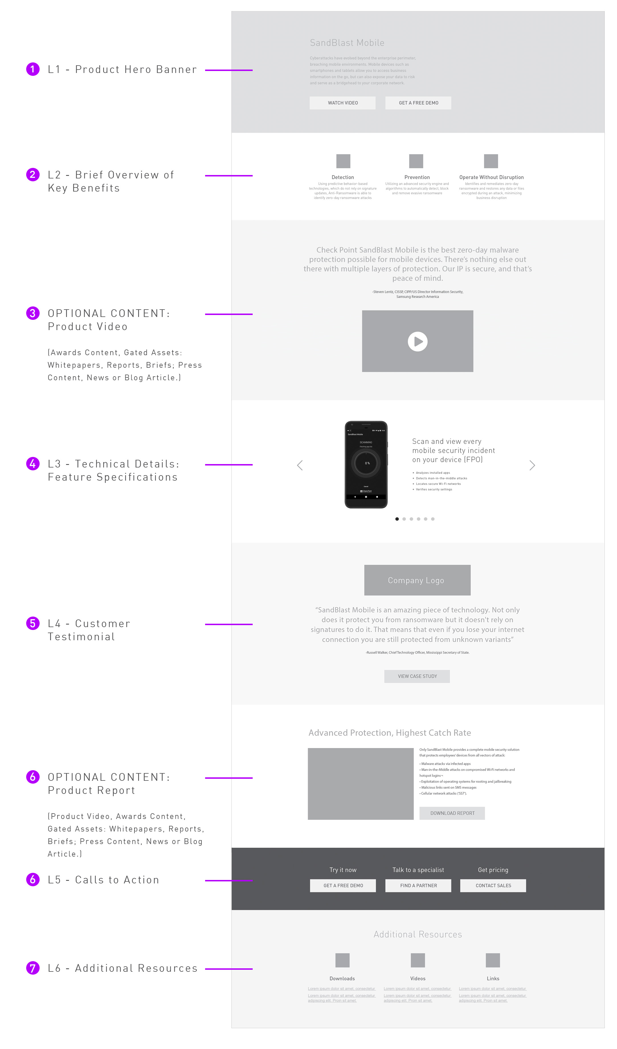
Considering the needs of all content influencers and the goals of visitors, adaptable content templates were created for the teams to follow when generating page content.
These templates addressed various visitor needs, including C-level content, marketing materials, technical specifications, product demos and trials, support documents, and more.
The content framework includes six mandatory levels (L1-L6) with optional sections that can be utilized based on the product’s needs and available content. Optional sections are flexible and can be updated as new content becomes available.
Product Page Wireframe
Proposed Strategy
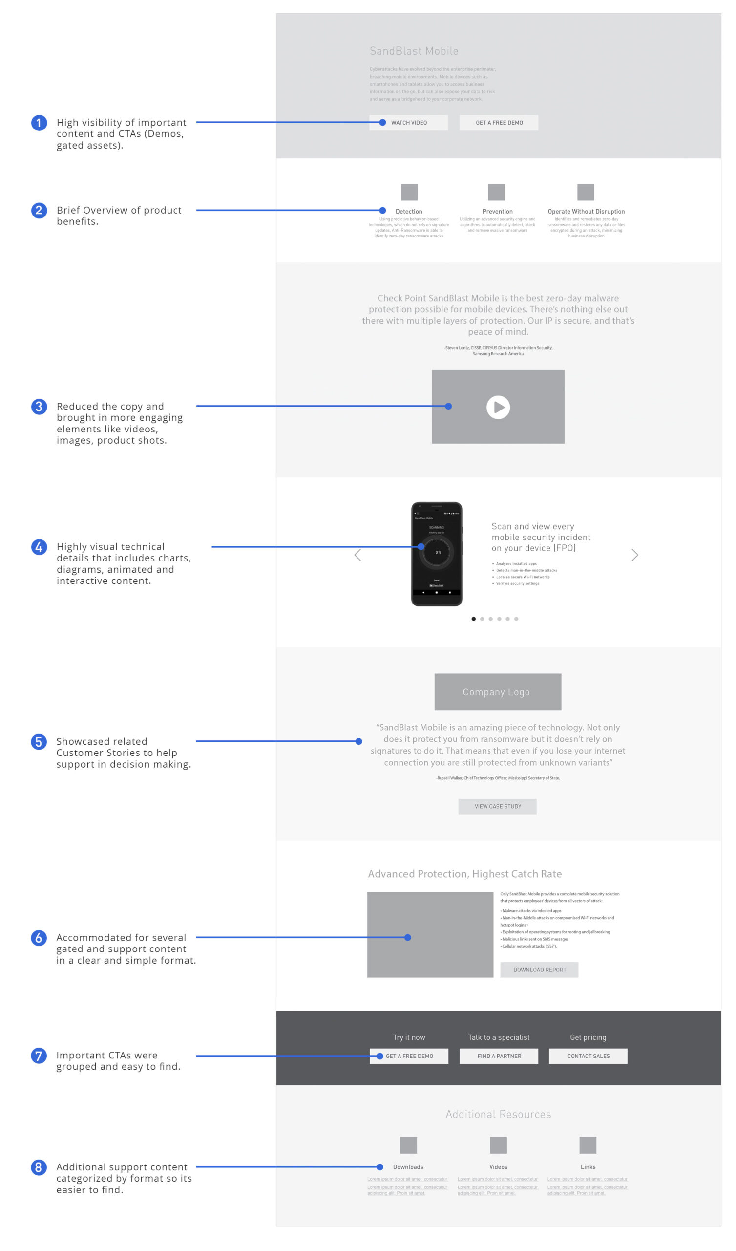
Through multiple co-creation sessions and design sprints with content creators and product owners, wireframes were developed to map out the content and UI of the updated navigation and each new page. This iterative process involved continuous refinement of content and solutions to address the needs of users and stakeholders effectively.

Navigation Wireframe
Product Page Wireframe
Crafting Experiences, Building Success
The redesign was a significant success, thanks to several key improvements:
- Tailored the content and design to meet the needs and preferences of the website visitors.
- Streamlined and modernized the UI and design for a visually appealing and user-friendly experience.
- Minimized copy and used wider bands of content to create spacious layouts, reducing clutter and enhancing readability.
- Structured the content to seamlessly adapt to various devices, ensuring a consistent user experience across desktops, tablets, and smartphones.
These changes not only led to improved engagement but also prompted a redesign of the entire website. This comprehensive overhaul further solidified Check Point’s brand and online presence and contributed to increased user satisfaction and business growth.
Design Systems
Content Catalog
The Content Catalog is a collection of various content elements and components including page structure, content and text blocks, images, videos and other essential elements that make up the content and structure of Check Point’s new web pages.
The catalog serves as a resource for web designers, developers, and content creators, allowing them to access, reuse, and maintain consistent design when creating new pages or adding to existing ones.
Pages from the Content Catalog
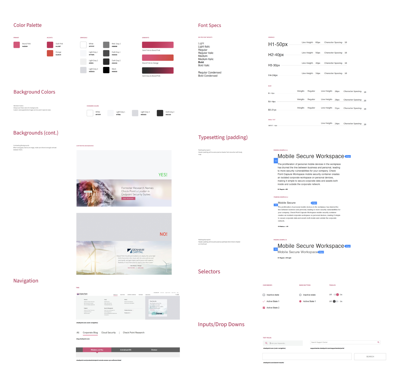
Digital Styleguide
A digital style guide was created as a comprehensive reference for critical design elements, including buttons, typography, color, navigation menus, and important UI components such as hover states, dropdown fills, and animations.
This style guide added significant value to the production process by eliminating design and brand inconsistencies across all digital products and websites.
Styleguide grab from XD
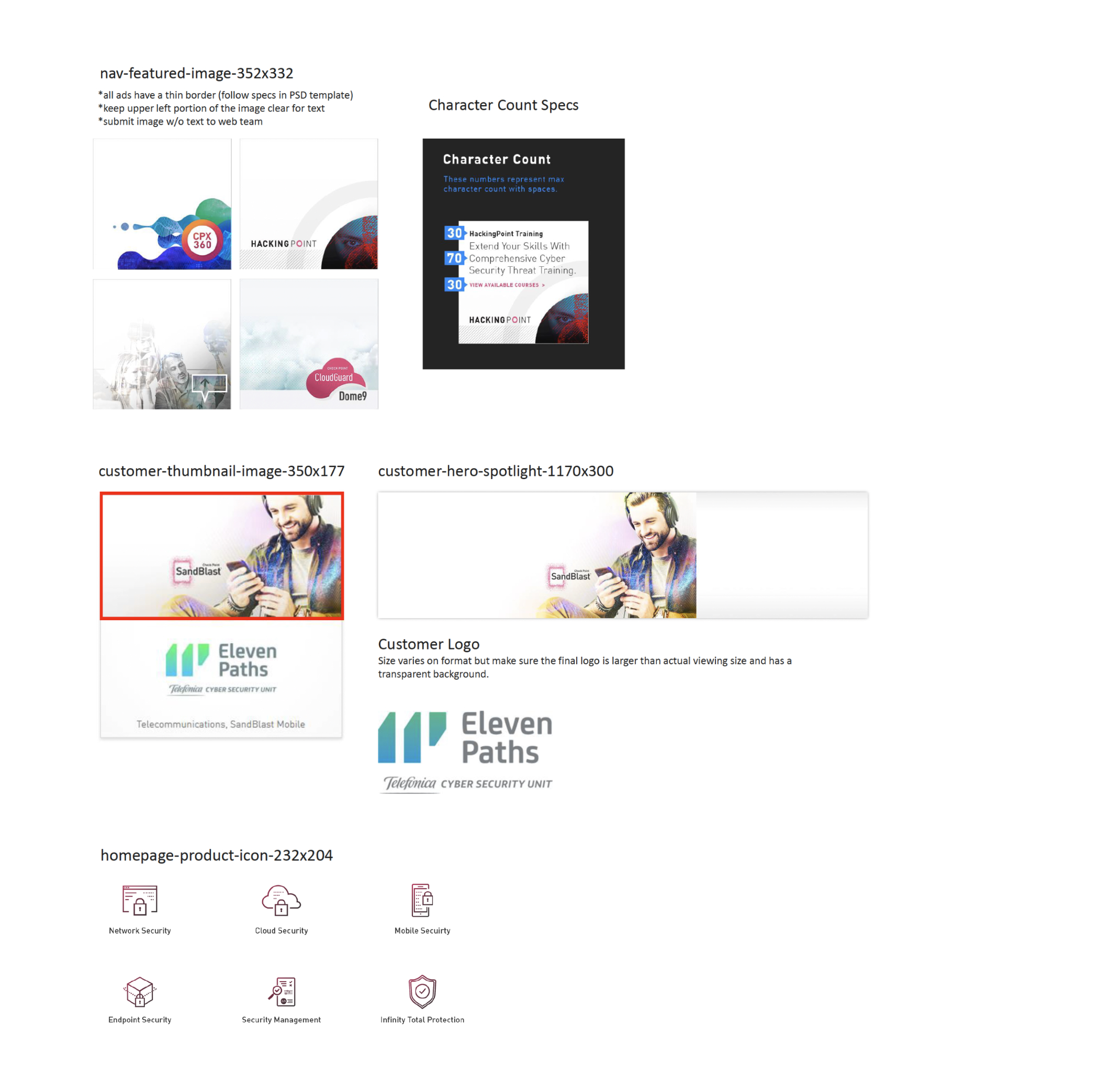
Digital Assets Library + Guide
To enhance consistency and quality across all digital products, a digital asset library was established, including images, banners, thumbnails, icons, charts, and various marketing ad templates. These assets were organized and made readily accessible on the server for efficient use. Additionally, a 35-page guide was developed to reference available assets and outline size specifications, image style preferences, copy guidelines, and requirements for asset creation and submission.
This resource has improved design consistency across the website, streamlined the asset request and production process, and is formatted for easy updates to align with evolving design and content standards.
Some digital assets from the library
Validation
Usability Testing
After the website launch, 5 test participants were engaged to complete a series of tasks to validate whether the issues with navigation and content accessibility had been resolved.
How the test works
Each participant was asked to complete four tasks on the website within a reasonable timeframe. Following each task, a series of questions were posed, and the experience concluded with a final questionnaire to gather comprehensive feedback on users’ impressions of the new design and functionality.
Continued Research
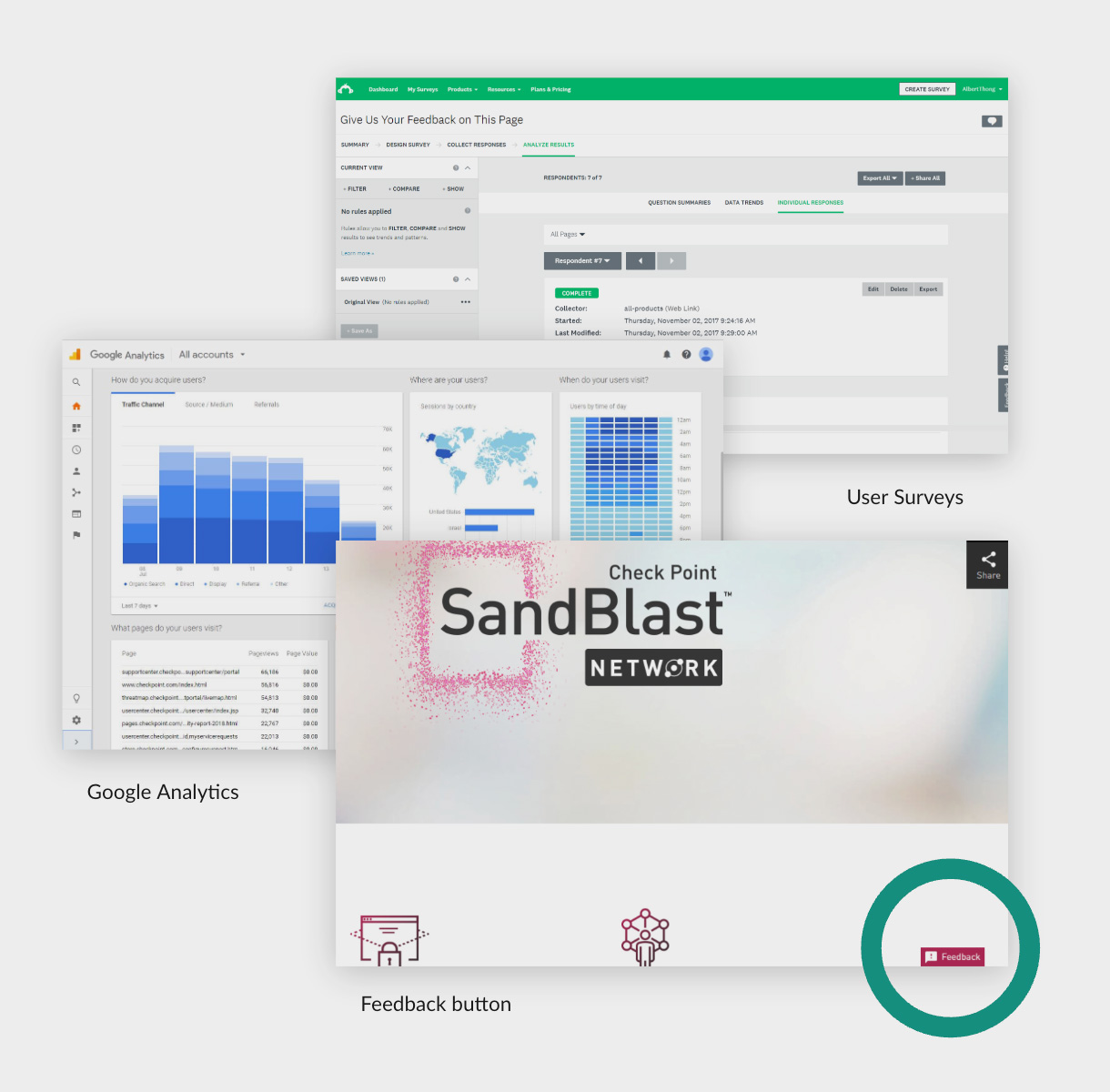
Commitment to gathering data and user feedback allowed for ongoing evaluation of the experience and continuous improvement of content and usability.
Various tools were utilized to collect experience data points, including:
- Google Analytics: We regularly analyzed website traffic, user engagement metrics, and behavior flow in Google Analytics.
- Feedback Prompt: We implemented a feedback prompt on the website to gather direct feedback from users post launch. This allowed people to provide comments, suggestions, and report any issues they encountered while browsing the new site.
- Page-Specific Surveys: We continued to conduct targeted surveys on specific pages to gather in-depth feedback on content, layout, and experience.
Key Take-Aways
Reflection
- Visitor frustration and feedback throughout the process were instrumental in guiding the best solutions.
- It became clear that research and inspiration are valuable at every stage of a project.
- The experience strengthened the ability to excel in a complex enterprise environment, highlighting the importance of adaptability, collaboration, and continuous learning in overcoming challenges.
Key Accomplishments
- Established Check Point’s UX process and methodology, setting a standard for future projects.
- Improved teamwork and efficiency through the implementation of project management and collaborative tools.
- Post-launch research indicated a 60% increase in user engagement and a 25% decrease in bounce rate.


